Best Guides to Master Matplotlib to Buy in May 2026

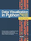
Data Visualization in Python with Pandas and Matplotlib


Numerical Python: Scientific Computing and Data Science Applications with Numpy, SciPy and Matplotlib


Matplotlib 3.0 Cookbook: Over 150 recipes to create highly detailed interactive visualizations using Python


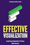
Effective Visualization: Exploiting Matplotlib & Pandas (Treading on Python)


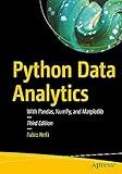
Python Data Analytics: With Pandas, NumPy, and Matplotlib


Matplotlib 2.x By Example: Multi-dimensional charts, graphs, and plots in Python


Python for Engineering and Scientific Computing: Practical Applications with NumPy, SciPy, Matplotlib, and More (Rheinwerk Computing)


Python and Matplotlib Essentials for Scientists and Engineers (Iop Concise Physics)


To add labels to the x-axis and y-axis in Matplotlib, you can use the xlabel() and ylabel() functions, which allow you to set the labels for the respective axes.
For the x-axis label, you can use the syntax plt.xlabel('label_text'), where label_text represents the desired label for the x-axis. Similarly, for the y-axis label, the syntax is plt.ylabel('label_text'), where label_text represents the desired label for the y-axis.
Here is an example:
import matplotlib.pyplot as plt
Example data
x = [1, 2, 3, 4, 5] y = [2, 4, 6, 8, 10]
Plotting the data
plt.plot(x, y)
Adding labels to x-axis and y-axis
plt.xlabel('X-axis label') plt.ylabel('Y-axis label')
Displaying the plot
plt.show()
In the above example, the plot consists of some sample data points. The xlabel() function is used to add the label 'X-axis label' to the x-axis, and the ylabel() function is used to add the label 'Y-axis label' to the y-axis. The plt.show() function is then called to display the final plot with the labels.
By customizing the respective input strings in xlabel() and ylabel(), you can provide meaningful labels to describe the data being plotted on the x-axis and y-axis accordingly.
How to label data points in a scatter plot in Matplotlib?
To label data points in a scatter plot in Matplotlib, you can use the plt.text() function. Here is an example:
import matplotlib.pyplot as plt
Create example data
x = [1, 2, 3, 4, 5] y = [2, 4, 6, 8, 10] labels = ['A', 'B', 'C', 'D', 'E']
Create scatter plot
plt.scatter(x, y)
Label each data point
for i, label in enumerate(labels): plt.text(x[i], y[i], label)
Show the plot
plt.show()
In this example, we have a scatter plot with five data points (x, y) and their corresponding labels. The plt.text() function is used in a for loop to iterate over each data point and add the label to the plot at the respective coordinates.
You can customize the label's appearance by modifying the parameters of plt.text(), such as the font size, color, alignment, etc.
How to change the font size of axis labels in Matplotlib?
To change the font size of axis labels in Matplotlib, you can use the fontsize parameter of the set_xlabel() and set_ylabel() methods of the Axes object. Here's an example:
import matplotlib.pyplot as plt
Create some data
x = [1, 2, 3, 4, 5] y = [1, 4, 9, 16, 25]
Create a figure and an axes object
fig, ax = plt.subplots()
Plot the data
ax.plot(x, y)
Set the font size of x-axis label
ax.set_xlabel('X-axis label', fontsize=16)
Set the font size of y-axis label
ax.set_ylabel('Y-axis label', fontsize=16)
Show the plot
plt.show()
In this example, the fontsize parameter is set to 16, but you can change it to any other font size that suits your needs.
How to create a scatter plot in Matplotlib?
To create a scatter plot in Matplotlib, you can follow these steps:
- Import the necessary libraries:
import matplotlib.pyplot as plt
- Prepare the data:
x = [1, 2, 3, 4, 5] # x-coordinates of the data points y = [2, 4, 6, 8, 10] # y-coordinates of the data points
- Create the scatter plot:
plt.scatter(x, y)
- Customize the plot labels and title (if desired):
plt.xlabel('X-axis') plt.ylabel('Y-axis') plt.title('Scatter Plot')
- Show the plot:
plt.show()
Putting it all together, here's an example of a scatter plot:
import matplotlib.pyplot as plt
x = [1, 2, 3, 4, 5] y = [2, 4, 6, 8, 10]
plt.scatter(x, y) plt.xlabel('X-axis') plt.ylabel('Y-axis') plt.title('Scatter Plot') plt.show()
This will create a scatter plot with the given data points and display it on the screen.
What is the difference between plt.plot() and plt.scatter() in Matplotlib?
The main difference between plt.plot() and plt.scatter() in Matplotlib is the way they represent the data.
plt.plot() is used to create a line plot or a line connecting the data points. It is typically used to plot continuous data, such as time series or mathematical functions. When using plt.plot(), the x-axis values are assumed to be evenly spaced.
On the other hand, plt.scatter() is used to create a scatter plot or a collection of individual data points. It is typically used to plot discrete or unstructured data. When using plt.scatter(), the x-axis values do not need to be evenly spaced.
Another difference is that plt.plot() can accept multiple arguments such as color, line style, and marker style to customize the appearance of the line, while plt.scatter() accepts various arguments to customize the appearance of the individual data points, such as color, size, and marker style.
In summary, plt.plot() creates a line plot connecting the data points, while plt.scatter() creates a scatter plot with individual data points.
